A weekly feature on my blog where I post up cover images that fit a weekly theme - art styles, artists, colour schemes, etc. In essence, this is a meme that celebrates book covers as pieces of art. Covers link to larger images and titles to goodreads summaries.
This week's theme: Title Fonts
special/pretty fonts that compliments or stands out even more than the images
Examples
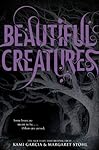
Beautiful Creatures by Kami Garcia & Margaret Stohl
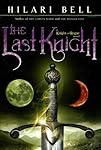
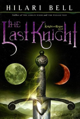
The Last Knight by Hilari Bell
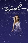
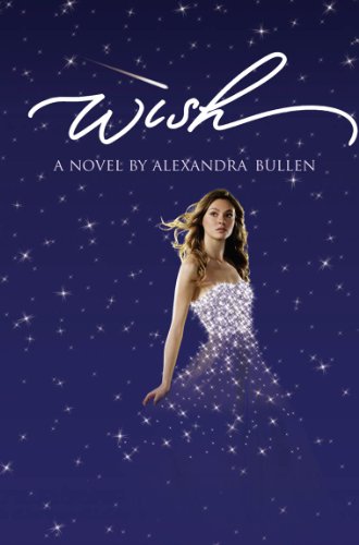
Wish by Alexandra Bullen
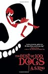
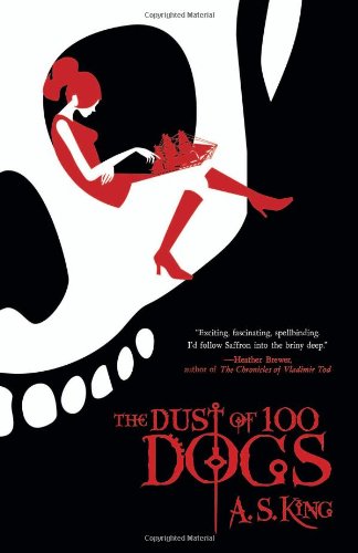
The Dust of 100 Dogs by A.S. King
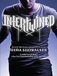
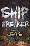

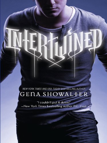
Intertwined by Gena Showalter | Ship Breaker by Paolo Bacigalupi
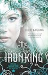
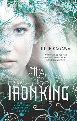
The Iron King by Julie Kagawa | Beautiful by Amy Reed
Your Suggestions
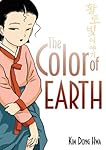
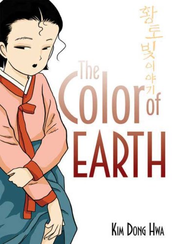
The Color of Earth by Kim Dong Hwa, suggested by: Ah Yuan
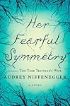
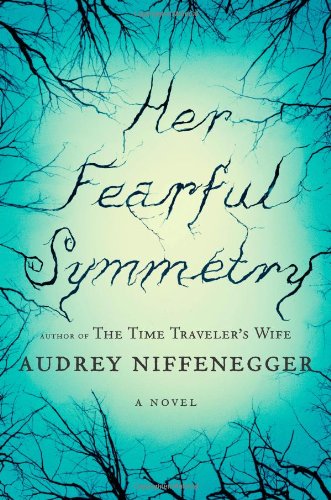
Her Fearful Symmetry by Audrey Niffenegger, suggested by: vvb32
My Thoughts
The title is usually of great importance to a book cover. I love it when cover artists take the time to really fancify the titles rather than just slap them on half-assed in the default Times New Roman font (though that works for some designs). Covers like those of
Magic Under Glass (old ver.) and
Bleeding Violet, and a lot of smaller-name publisher books, suffer greatly from the horrible fonts/effects used for the titles despite gorgeous cover images.
What are your favourite covers with special/pretty fonts? Or, what covers do you think benefits greatly by the design of the title, special or not?


4 comments:
I love the beautiful creatures & the Iron King cover! Though I'm not going to lie, I don't find Beautiful Creatures cover very unique. And I think it could of been better. But that's just my opinion.
Those really are some amazing fonts - they absolutely add to the cover of the book!
I like how you pointed out the font for Bleeding Violet. I think, while it's conceptually interesting (blood imagery, and all) but it just doesn't work. I think the problem of that particular font is that it doesn't stand out and blends too much with the background? x.x
But yes, out of all the fonts, I like Beautiful Creatures best. I looooooove how it blends with the trees. And the colour contrast. I think colour contrast is really important in getting the title to stick out and be memorable. (And of course titles are important because if the cover title doesn't stick out for us, how do we remember it, right? ^^;)
But hey, what about nods towards simple fonts that still stick out? I'm asking this 'cause I'm staring at the covers of The Color of Earth trilogy, (manhwa series) and I really like the placing of the title in the translated English covers. It's simple font, but elegant and I like how the colours makes sense with the title and go with the figure on the side. Simple font against a white backdrop can also go a long way, methinks. 8D
i agree that the title font is eye grabber. these are good pics. the one that is in the forefront that i like is Her Fearful Symmetry.
Post a Comment